1、 First, set the "brand base makeup": core visual elements, without any confusion
The key to building a chain brand is to recognize it at a glance. This plan first fixes OPALLUB's "visual identity card" to ensure that all stores in Xinjiang are consistent:
1. LOGO: Fixed proportion, cannot be moved or changed
The OPALLUB brand logo is a "fixed combination unit", whether it is a horizontal version or a combination with "OPPEIN Lubricant Maintenance Center". The proportion, element spacing, and alignment cannot be changed, and even the size of individual letters has grid drawing specifications (such as the letter spacing of "OPALLUB" in horizontal combinations being 0.20x and the height being 7.10x), ensuring that the "authentic" brand logo can be seen anywhere. 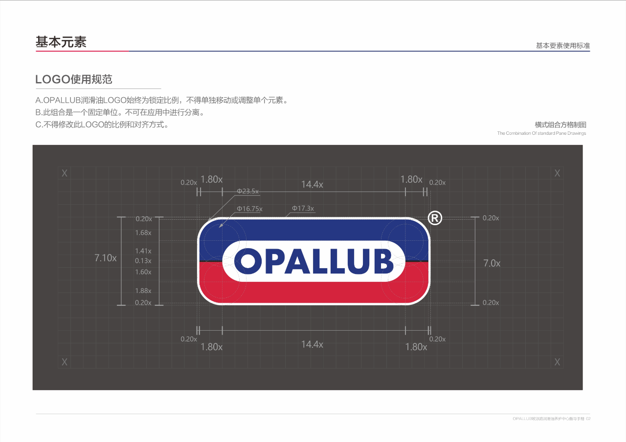
2. Color: Three color tone, one color for all stores nationwide
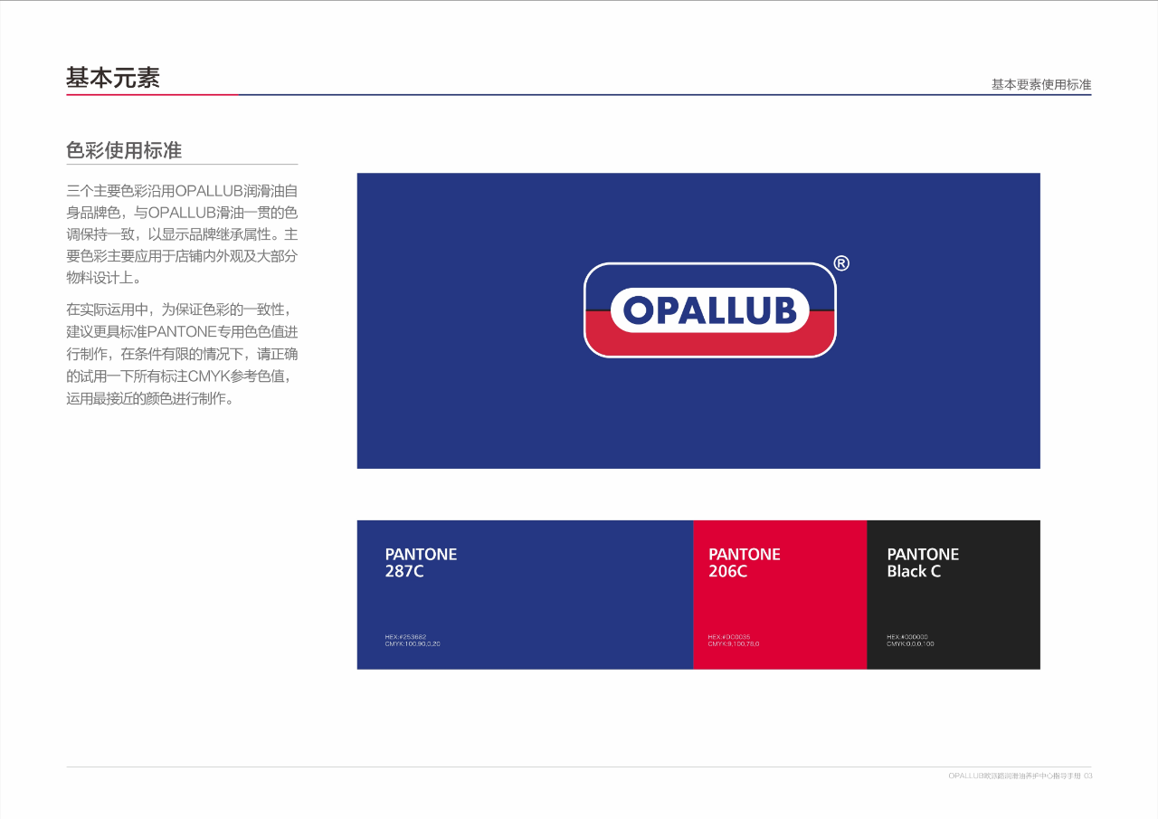
Using the classic three colors of the brand, from the front door to the promotional posters, all should follow this:
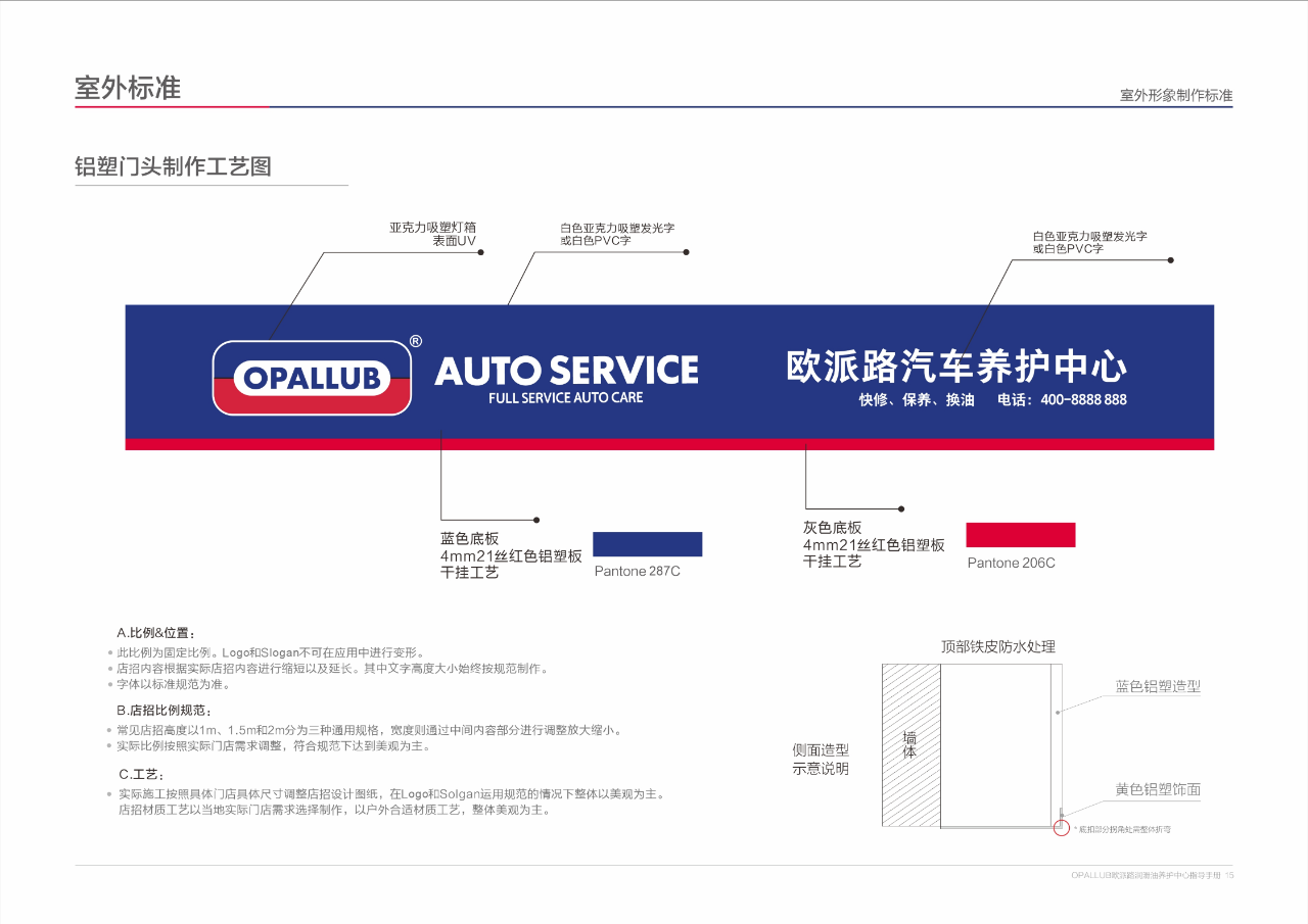
Main color blue: PANTONE 287C (front door, reception desk, equipment main color)
Auxiliary Red: PANTONE 206C (decorative strip, advertising highlight color)
Basic Black: PANTONE Black C (font, logo core color)
Even for printed fabric door heads, it is recommended to adjust according to PANTONE color values. If conditions are limited, use CMYK reference values (blue: C100 M60 Y0 K20) as close as possible to avoid the embarrassment of "this blue and that gray".
3. Font: Chinese and English, both with "designated style"
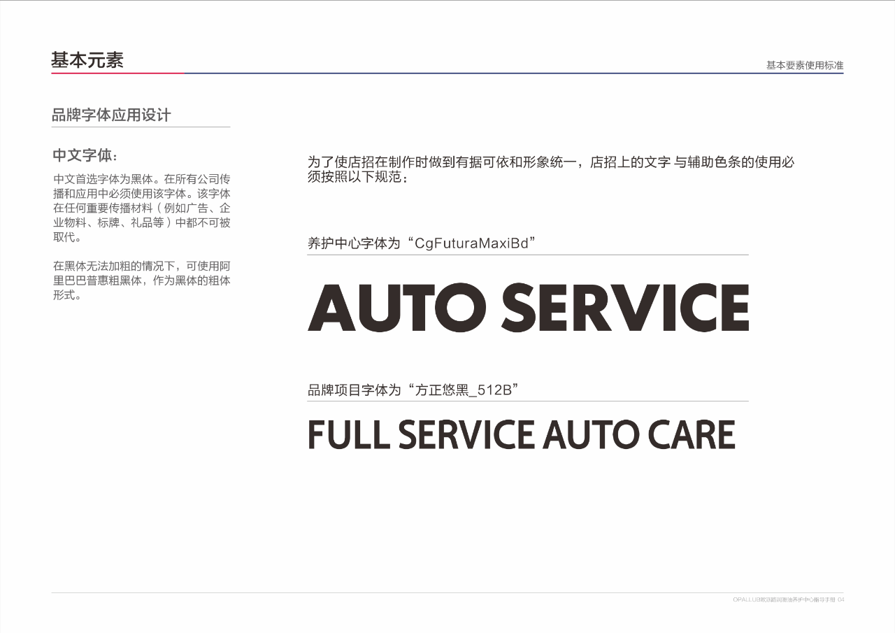
Black font is preferred for Chinese, and important materials such as doorheads and reception desks must be used; Can't you make black font thicker? Just use Alibaba Puhui bold font;
English scene: For outdoor advertising and signage, use Frutiger CE 45 Light (fine) or Franklin Gothic Medium (thick) to ensure clarity even at long distances;
Even service words such as "maintenance and oil change" and "quick repair and maintenance" are designated to use "Fangzheng Youhei_512B" to avoid messy fonts and reduce professionalism.
2、 Reinstall the "storefront responsibility": Outdoor door head, 3 materials to choose from according to needs
The storefront is the "face" of the store, and even the size, material, and craftsmanship are classified in the plan, so franchisees don't have to guess for themselves
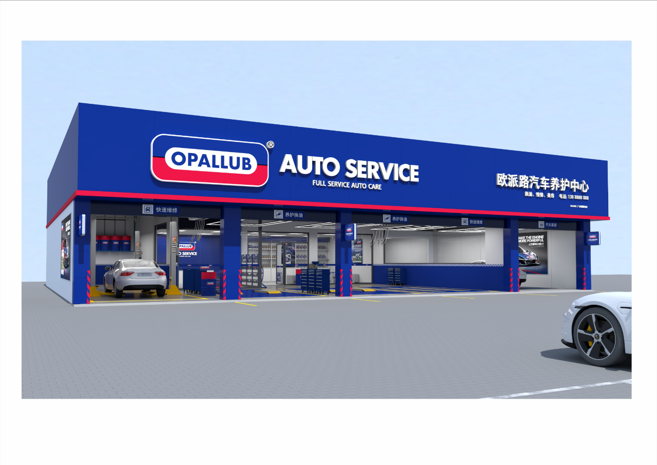
1. Store sign: Different store lengths correspond to different styles
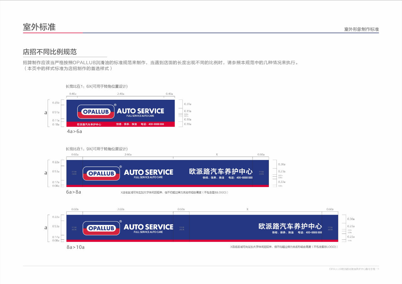
Whether your store is a 1:6 corner store or a long store with a minimum of 16a, there are ready-made proportion standards:
Small storefront (4a-6a): compact layout, LOGO+"AUTO Service"+service items (oil change, repair, beauty)+phone, one or more;
Large storefront (16a-20a): The store name area can be appropriately widened, but the font height cannot exceed the height of the logo combination to avoid top heavy and top light;
Special Size (4:3): Specially designed for vertical layout, suitable for narrow storefronts and still eye-catching.
2. Material: 3 options, suitable for different needs
Do you want to operate for the long term and showcase your level? Choose aluminum-plastic panel, equipped with 0.5cm LED luminous characters, with a shelf life of 1 year, and can be used for 5 years;
Stable cooperation and cost-effectiveness priority? Using C84 color steel buckle plate with iron sheet letters, it is durable for 3-5 years and has a moderate cost;
Just starting out, trying and making mistakes first? Choose 550 Baoli cloth, suitable for short-term cooperation, with a one-year shelf life and flexible replacement.
3. Details: Door lintels, rolling shutter doors, and light boxes are all standardized
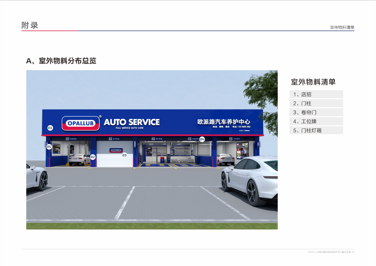
The entrance of the lintel should have a ramp and draw yellow traffic arrows for PANTONE 108 to facilitate car owners to drive into the store;
The rolling shutter door is made of gray color, with the logo width occupying one-third of the door. It is fixed with paint or PVC board hollow out, and the brand can be seen even when the door is closed;
The outdoor light box is made of 8cm thick aluminum profiles and transparent vacuum formed panels, with double-sided printing of "OPALLUB AUTO Service", which can attract customers when illuminated at night.
3、 Interior "professional skeleton": functional zoning+equipment specifications, customers can sit with peace of mind
Entering the store, customers' trust comes from the details of the decoration. The plan divides the indoor area into 6 major functional zones, each with its own requirements for installation and placement
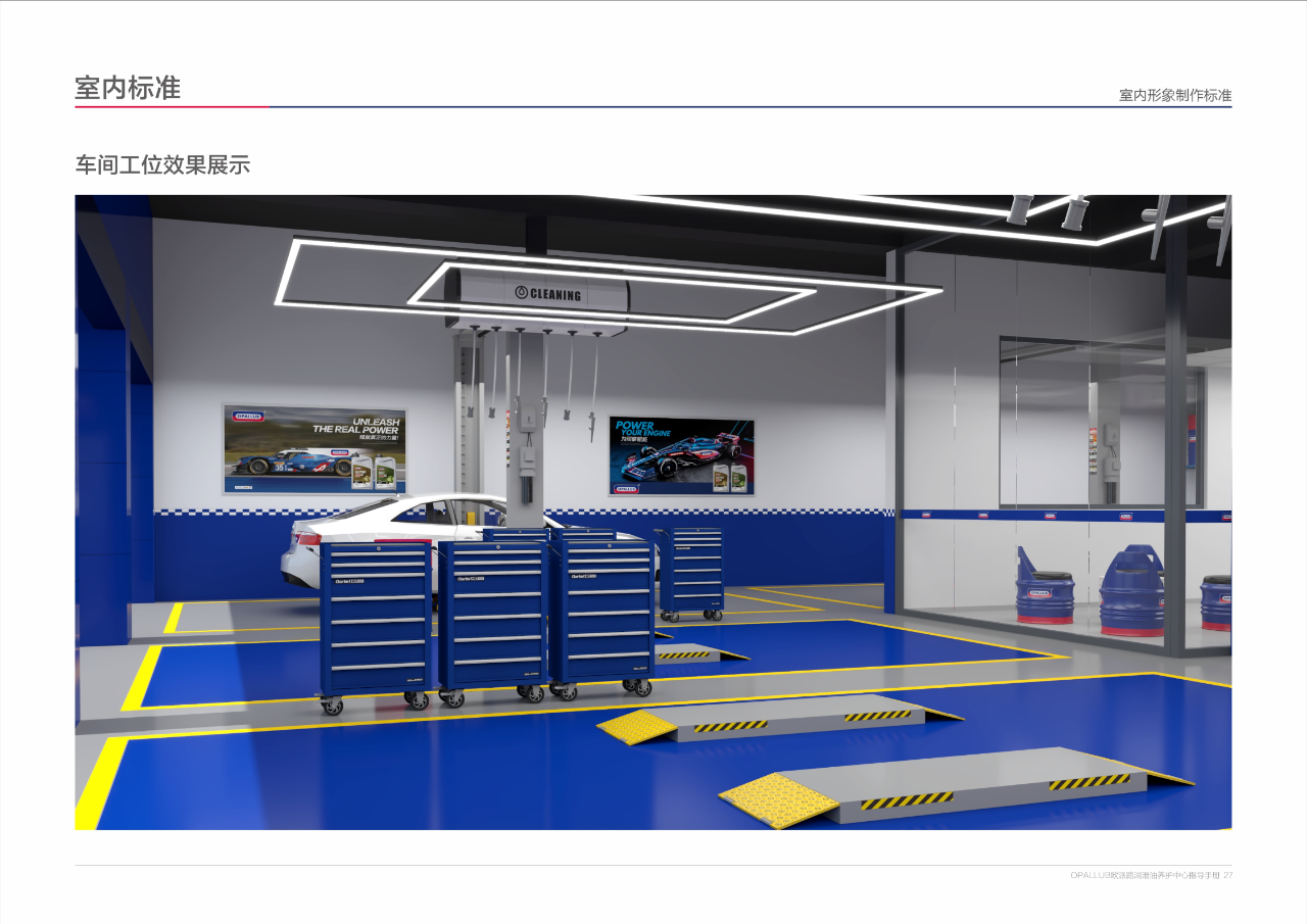
1. Functional zoning: Clear flow, no detours, and no crowding
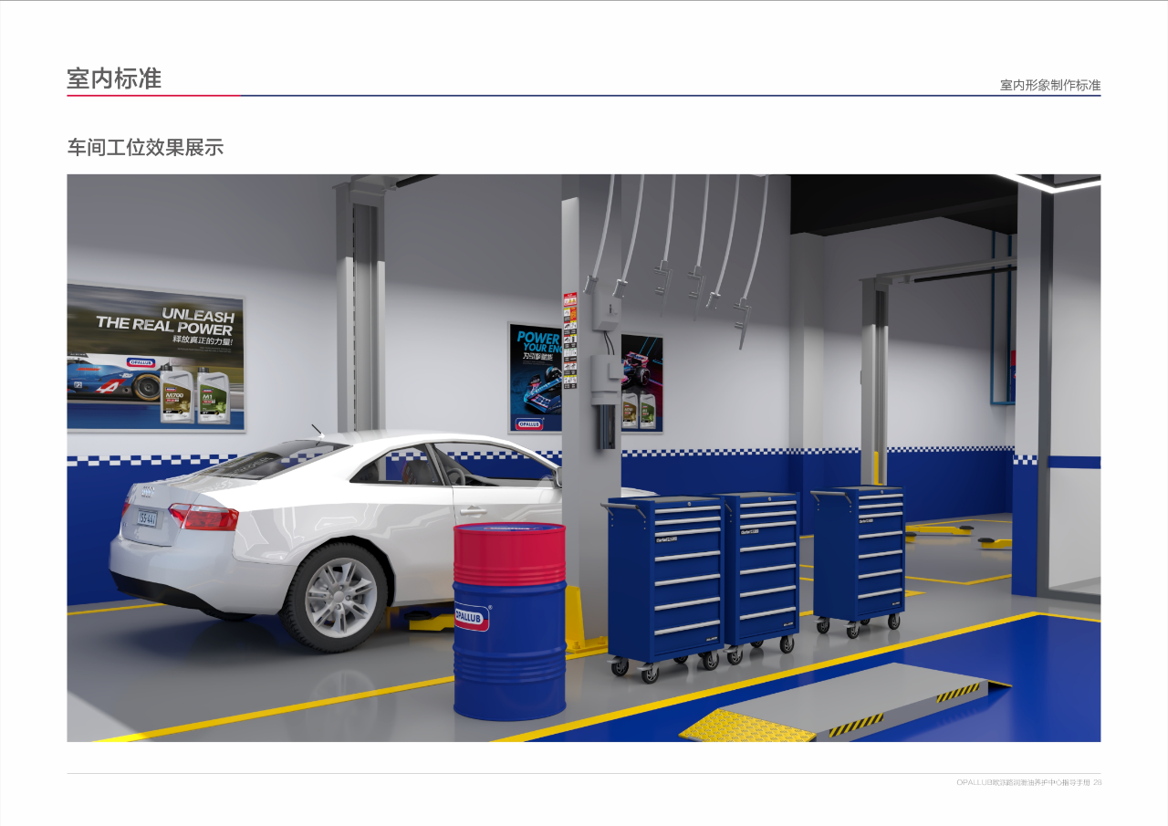
Upon entering, proceed to the reception area (equipped with a standardized reception desk, standard size 2400x600x1000mm, adjustable), next to which is the product display area (iron paint display rack, oil and cleaning solution display, warm embedded tube lights for lighting);
Customer rest area: light beige floor tiles+white latex paint wall, with observation window (0.8m above the ground, 1.5m high, laminated glass fireproof), where you can see the workstation operation, rest assured;
Working in the fast maintenance area/repair area/washing area: Hang the "maintenance and oil change" and "fast repair and maintenance" guide icons above the workstation, prioritize blue, red, and gray equipment, and place mobile devices against the wall without blocking the passage.
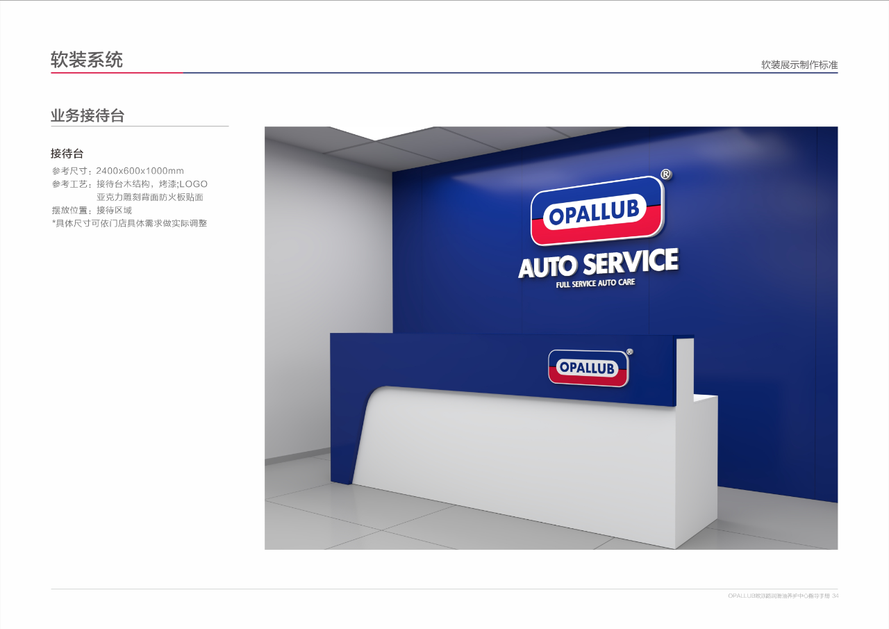
2. Workstation details: There are standards for everything from the wall to the equipment
Wall: Stick 1.3m high blue and white checkered waistline (PANTONE 287C blue paint), brush white latex paint underneath, clean and professional;
Equipment: The gas source pipeline should be mounted on beams or buried underground, with the interface 300mm above the ground. In addition to being used for workstations, 2-3 gas sources should be reserved for easy equipment installation;
Advertising posters: Brand promotional posters should be hung on the walls of workstations and guest areas, with high-definition photos covered in matte film, hung 2m above the ground, with a spacing of ≥ 0.3m between each image. The content should choose brand slogans such as "Let the engine become powerful again" and "Release true power" to strengthen awareness.
4、 Finally, "soft outfit bonus points": even work clothes should be unified
The brand image is hidden in the details, and the plan even standardizes "people" and "small materials":
1. Soft decoration materials: reception desk, display rack, posters, made according to the picture
Reception desk: Wooden structure baked paint, front embedded with acrylic carved logo, back pasted with fireproof board, size 2400x600x1000mm, can also be adjusted according to store space;
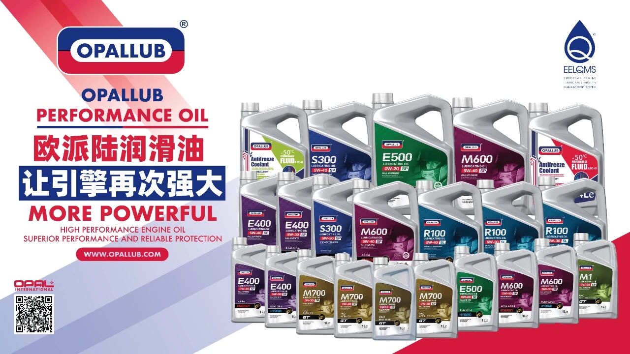
Product display rack: Made of wrought iron material, brushed with brand blue or gray, with a layer height suitable for OPALLUB machine oil drums, easy to access;
Promotion poster: Unified use of 12mm thick density board+high-definition photos, with edges sealed around, fixed to the wall with dovetail grooves to avoid tilting and twisting.
5、 Flexible and not rigid: the core remains unchanged, details can be adjusted
Worried about different store sizes,The plan doesn't work?Dont worry ——
core element(LOGO、Color and font)Must be unified
Ensure brand recognition; 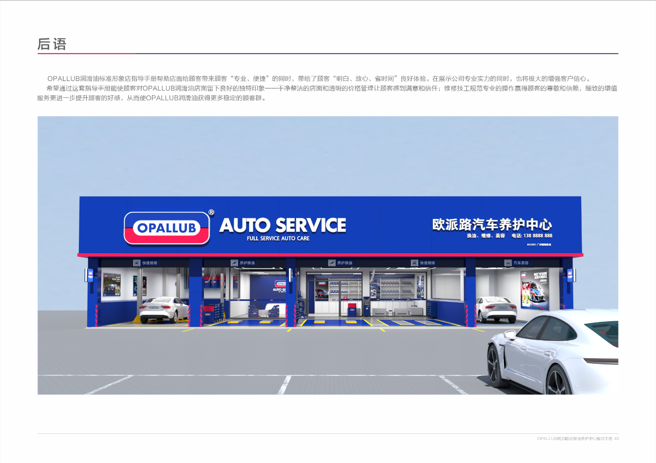
Want to join? This plan is your 'shortcut to opening a store'
